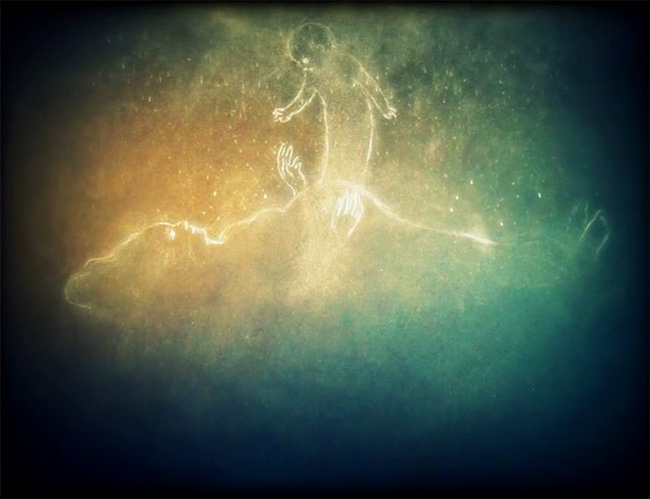
Filmmaker Myrrha Jamil is working on a new film about the iboga, the sacred visionary plant of West Africa. Looks and sounds great so far.
Author Archives: Cimaxion
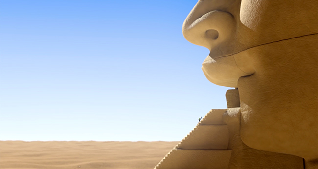
The Egyptian Pyramids: Animated Short
The students at the French computer graphics and animation school, Supinfocom made this amusing little animated film.
It was directed by Corentin Charron, Lise Corriol, Olivier Lafay, and Nicolas Mrikhi.
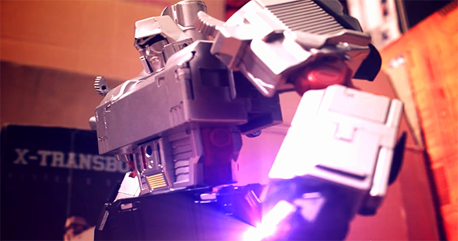
Transformers Generation: Wild Robot Action Fan Film by Harris Loureiro
Filmmaker Harris Loureiro went to the store and bought himself a bunch of robot toys. Then he made a Transformers movie. It’s a wild, action-packed thrill ride of a stop-motion extravaganza, complete with voice overs and a fittingly super-dramatic score. Have fun!
The Alchemist’s Letter: Animation by Carlos Andre Stevens
Student Academy Award® finalist Carlos Andre Stevens made this beautiful short animated film about a man who invents a machine powered by his own memories.
It’s narrated by the magnificent British actor, John Hurt.
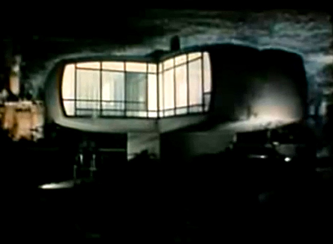
Monsanto House of the Future in 1957 Tomorrowland
This is more interesting than it looks. Monsanto – yes, that evil company that takes dirt and turns it into a lawyer – worked with Disney to build a house of the future in Disneyland. It was intended to show how plastics would revolutionize home building. Apparently, the house was so strong that when Disney tore it down at the end of the sixties they could not break the outer shell with wrecking balls.
My primary interest in the film, aside from the mentally challenged smiling morons that inhabit Monsanto’s future vision, is the fascinatingly awkward focus on comfort as the primary aspect of life in the future. I think a great new science fiction film could be made by some nutty director who would look at the future of industrial films like this one for inspiration. It could be the antidote to the completely bleak, dystopian, post-apocalyptic dumb soup being offered by witless filmmakers like Neill Blompkamp. The thudding incomprehensibility of such work must eventually be counteracted by a house of the future and people who think they are happy!
Fantastic Visual Explorations in the Films of Michele Smith
Filmmaker Michele Smith has been exploring the relationships between film and video for many years. Her work is – to say the least – brilliant and voluminous, ranging from found footage movie trailers to family beach films, commercials, street video, newspaper, View-Master slides, bits and pieces of plates and plastic. If you visit the filmmaker’s YouTube channel and decide to list everything available, you are going to be amazed. There’s so much there. It’s like digging through a museum of filmic ideas. Make no mistake, the ideas come at you in a dizzying array, too much to absorb immediately as the images pop and crackle like a slowly exploding bomb. Split seconds are all that are necessary for Smith to make a point, breaking footage into mere 2-frame segments that play against each other to form brand new images in the mind’s persistence of vision. You’ll know what I mean if you use the pause button to do a little digging into Smith’s complex constructions. I doubt she would mind. The reality of video on the web and how we use it seems to be something she is more than comfortable with.
I always enjoy filmmakers who look at cinema as it really is.
I also enjoy filmmakers who pursue the messy art of images. Sites like YouTube and Vimeo are depressingly overloaded with filmmakers who have gotten very excited about their super-glide floating camera rigs and long DSLR lenses. They make shiny, gleaming, gliding, perfect little advertisements for themselves and include tastefully typed title sequences.
Michele Smith is the filmmaker who takes their lunch money and spends it on a hamburger, not a tripod.
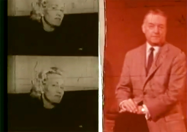
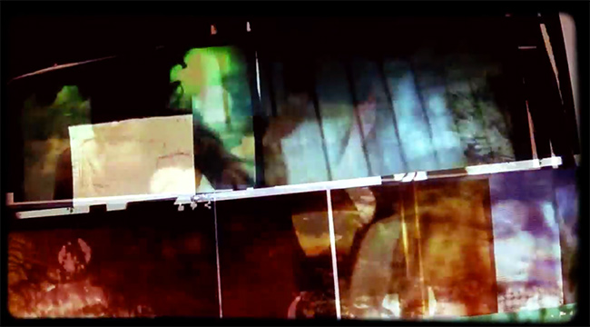
In this first film from 2003, ‘Like All Bad Men He Looks Attractive – They Say,’ Smith uses found 16mm footage from several films to not only intercut various images, but to construct animations out of the footage laid out in various patterns, sometimes along with other cutout images or materials which are then photographed to video. She often reanimates the celluloid by photographing frames in sequence. I consistently get the impression of two cinematic forms playing off each other. Some of this found footage was rescued from a fire and you can see the melted edge of the filmstrip.
Film captures light. Video captures ideas.
These are ideas Smith is offering. The images are most often gorgeous, sometimes jarring. They unsettle. Sometimes they irritate. She has that knack for constantly returning to something, working it under the skin.
In this film, we see things of beauty as advertised – constantly expecting a promised perfection, but always seeing through to threat and decay. In spite of its underlying darkness, the film is a celebration of art and cinema, constantly using one to build the other. Strips of perforated film are arranged to form individual artworks. Photographs are shredded and arranged alongside torn away optical sound strips. Advertisement or catalog images of statues and vases pass by, attempting to become film. One form is always vying for a place in the overall structure, always trying to be something other than itself.
Even though it was shot to video, the film is built with rapid cuts between fleeting images. The short durations and constant cutting from shot to shot create superimpositions in the mind of the viewer. Toward the end of the film, around the 1:08:00 mark, a woman appears standing on a small boat. She seems to drift through a sea of hazy, flickering decay. But she doesn’t. The images that seem so intertwined are completely separate.
Here is ‘Like All Bad Men He Looks Attractive – They Say:’
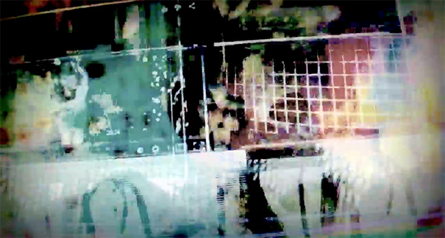
Here’s another film called ‘Things.’ This is a more recent one in which Smith points a camera at a computer monitor showing a web page with many of her films embedded. She then scrolls up and down the page, creating a film frame flicker effect. She ups the ante continually by layering the video.
The point I am making is that there is intense experimentation going on here with what constitutes the primary differences between film and video. It seems almost a casual mockery of filmmakers who go to great lengths to get old filmic effects into their videos. Hairs and scratches and jitters that have no meaning whatsoever in modern cinema. But it’s also a look at how mimicry of an old form leads to new things when used consciously.
I think it was Godard who said some years ago that superimposition is the great new language made possible by video. Only video makes layering of images as simple and direct as the frame to frame cut once was with celluloid.
Smith presses into the new cinema/internet idea further in other films as she begins using internet shopping sites with long image arrays selling jewelry and watches. She scrolls through them, seeming to wonder at how we create cinema for ourselves without realizing it. We bombard ourselves with a flurry of images every day, overloading and completely enveloping ourselves in our own self-reflecting movies.
Here is ‘Things:’
The computer monitor superimposition effect is used again here in a film called Things 3.
Here is ‘Things 3:’
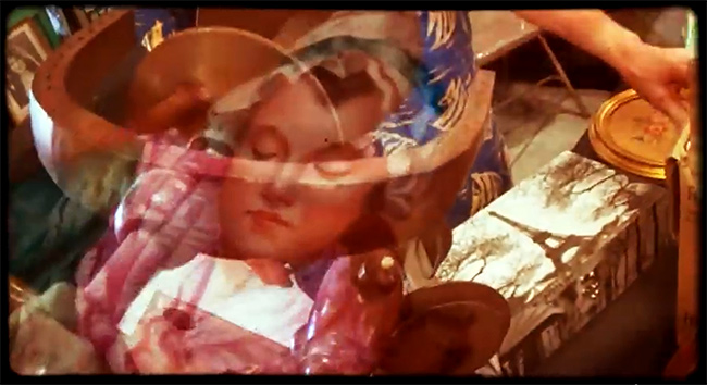
Another film, ‘Spinning Wheel Medusa, Drama Between a Monkey and a Nude,’ uses techniques that come naturally to video. Shot with a hand held video camera inside what appears to be some kind of crafts expo or bazaar, the film layers images of a spinning wheel, decorative plates, embroideries, vases, statues and various bric a brac.
Always aware of the history of art, the film seems intent on elevating decorative objects to a realm of higher purpose. Here we see the rapid cutting of previous films losing favor to the more languid drift of layered video images. My own view is that the layering of images is much more difficult than frame to frame cutting. Layering presents the problem of making a single image from multiple images while gaining power instead of losing it.
Here is ‘Spinning Wheel Medusa, Drama Between a Monkey and a Nude:’
Michele Smith’s films have been shown at many international film festivals, including The New York Film Festival, The Times BFI London Film Festival, Chicago Onion City Film Festival, and Anthology Film Archives Screenings.
The filmmaker’s web site is Actipes Films.
