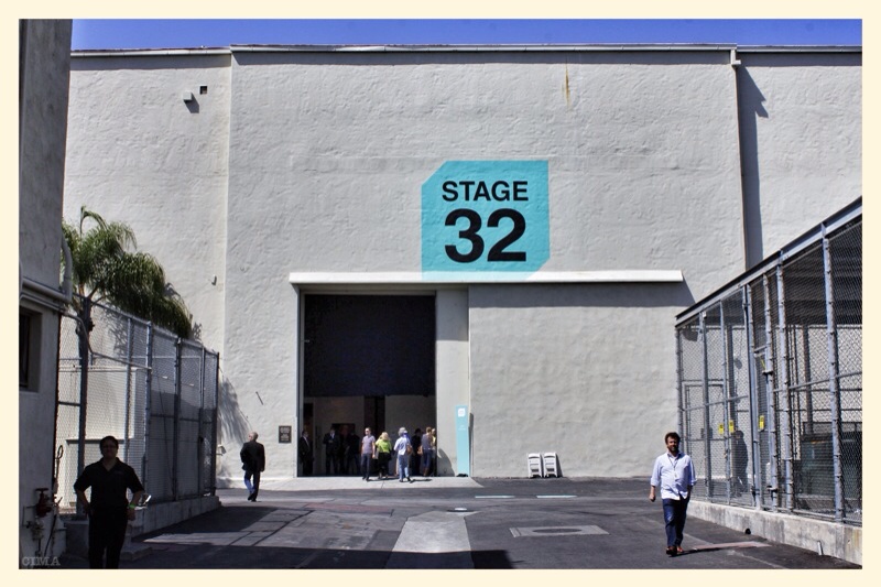
Recognizing Los Angeles as the world art center that it is, Paris Photo brought its world famous exposition of photography to the Paramount Studios lot for three days (April 26 – 28). The expo featured sixty international galleries and twelve book publishers, all given mini-gallery spaces that temporarily converted two giant Paramount sound stages into world class museums complete with screening rooms for the moving image portion of the expo.
I paid $40 to get a day pass and a copy of the catalog which provided information on all the presenting galleries and publishers. Each gallery had a page to offer one of its offered images. The book turned out to be a small but handsome little paperback. I wanted something bigger and better than that. A grand show like this needs a nice hardback catalog with pristine prints inside. I would certainly have been willing to pay much more for such a program book. As it was, I felt like we were given something on the slight side and it did not do justice to the depth and breadth of the exposition's still photography offerings.
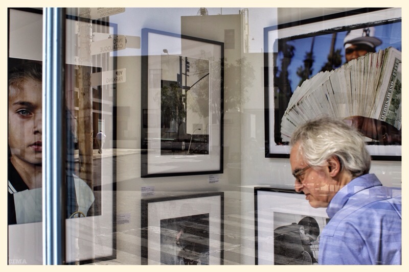
There was a lot to see and to be inspired by. World famous photographers covering decades of the art were shown. I'm always struck by the boredom turned to perception beauty of William Eggleston's pictures, a few of which were there. I saw some unsettling landscapes by Hiroyuki Masuyama that looked like 19th century Italian paintings. There was a mysterious dark image from Sally Mann, 1960s images of street life by Fred Herzog, ghostly disorienting photos and videos by Marion Tampon-Lajarriette, impossible industrial/medieval structures by Filip Dujardin, experimental videos by Gabor Osz, mixed media by filmmaker Bruce Conner, and photographs by Wallace Berman, to name but a small handful of the artists on display.
I was curious about how artists are using light boxes and videos. I am normally rather unimpressed with the lightbox format as it seems to try to artificially pump up a photograph. There were quite a few of those hanging around. However, one artist used the lightbox combined with inserted areas of high definition video to really intelligent and hilarious effect. This guy, Gregory Scott, builds up a scene by surrounding an inserted video element that meshes seamlessly with the still areas to create an intricate, well-timed commentary on both the creation and consumption of art. Imagine an image of a museum with paintings on the wall. Inside each painting we see the artist at work building the image. But his work extends to the deconstruction and reconstruction of the museum itself. These pieces were fascinating, entertaining and very expensive.
My big criticism of Paris Photo comes in the area of the moving image screenings. That segment was grossly inferior. I was able to watch precisely two films all day long at the Sound and Vision screenings. They were the classic experimental film, 'La Jetee' by Chris Marker and 'Breakaway' by Bruce Conner. They are both films from the 1960s and they are brilliant works. But I wanted films man! Lots of them. Don't try to show me how photography blends into film by throwing two films from the sixties at me! Make your case. Overwhelm me. And do it every day of the expo. What you spread out over three days is cheating. Sure, there were some other moving image offerings at mini-galleries, but this was a supposedly major element of Paris Photo and they just got stingy with it. I almost felt as if perhaps the organizers didn't want me sitting too long in a dark screening room where I would not be purchasing anything. Big weak spot here. It is significant and needs to be fixed. Really this shouldn't be hard. In a world where we can get educated on experimental film via YouTube a curator must do a hell of a lot better than this.
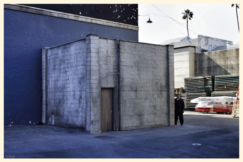
Paris Photo, despite its moving image shortcomings, is a welcome addition to the Los Angeles scene. It's inspiring because, unlike the studio that hosted the expo, it treats images seriously. You know, the way things are done in grown up places like New York and Paris. Everything about L.A. is sort of covert and most serious things are required to exist on the fringe. But it's not a bad thing for serious art to orbit a grotesquely commercial and vapid center. One can feed off of fantastic absurdity and consider it part of what a city has to offer (see photo below).


